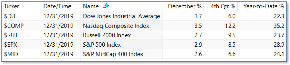
The year 2019 was quite unusual in this way: no matter where you look in the tables below, there’s one thing you won’t find – a negative return! Investors were rewarded – and especially for Q4 – as “everything worked.”
That’s not to say that everyone’s wishes were fulfilled, however. Only one of the most‑common predictions about 2019 came true: Emerging Markets lagged (again), and U.S. SmallCap trailed both U.S. LargeCap and U.S. MidCap, despite being the most commonly-predicted winners.
There was one common prediction that did come true, however, thanks to a very strong Q4: U.S. LargeCap Value outperformed, and for the first time in a decade! A strong rotation from Growth to Value in Q4 boosted many Value stocks and gave the group as a whole a strong quarter and strong year.
Historically, very good years are usually followed by good years. Since 1950, there have been 18 of those “very good” years with gains of 20% or more. The follow-along years were 15-3, for an average gain of 11.2%, much of the gain coming in the fourth quarters (18-0 for a positive Q4 gain).
Long Term Market Valuations
The long-term valuation of the market is commonly measured by the Cyclically Adjusted Price to Earnings ratio, or “CAPE”, which smooths out shorter-term earnings swings in order to get a longer-term assessment of market valuation. A CAPE level of 30 is considered to be the upper end of the normal range, and the level at which further PE-ratio expansion comes to a halt (meaning that increases in market prices only occur in a general response to earnings increases, instead of rising “just because”). The market is currently at that level.
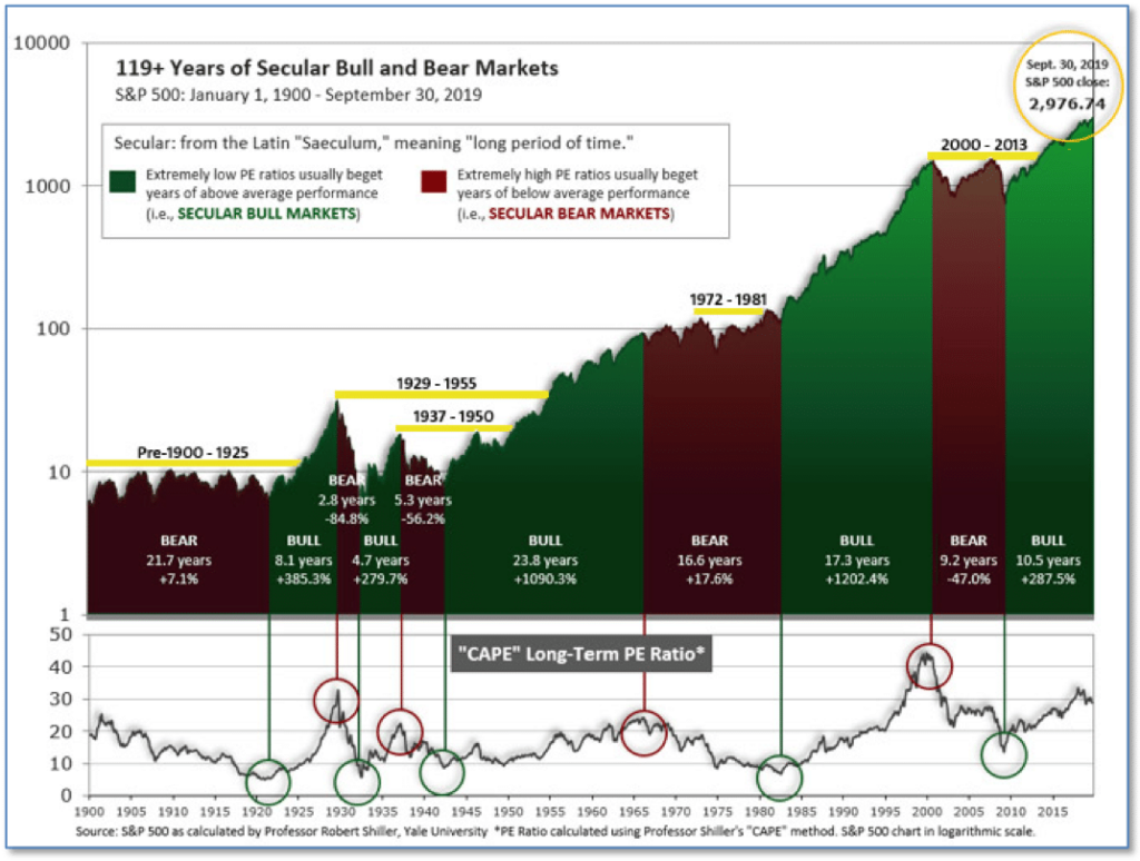
Figure 1 – 100-year view of Secular Bull and Bear Markets
Of course, a “mania” could come along and drive prices higher – much higher, even – and for some years to come. Manias occur when valuation no longer seems to matter, and caution is thrown completely to the wind as buyers rush in to buy first and ask questions later. Two manias in the last century – the 1920’s “Roaring Twenties” and the 1990’s “Tech Bubble” – show that the sky is the limit when common sense is overcome by a blind desire to buy. But, of course, the piper must be paid and the following decade or two are spent in Secular Bear Markets, giving most or all of the mania gains back.
See Fig. 1 for the 100-year view of Secular Bulls and Bears. The CAPE is now at 31.02, down slightly from the prior week’s 31.06, above the level reached at the pre-crash high in October, 2007. Since 1881, the average annual return for all ten year periods that began with a CAPE around this level have been in the 0% – 3%/yr. range. (see Fig. 2).
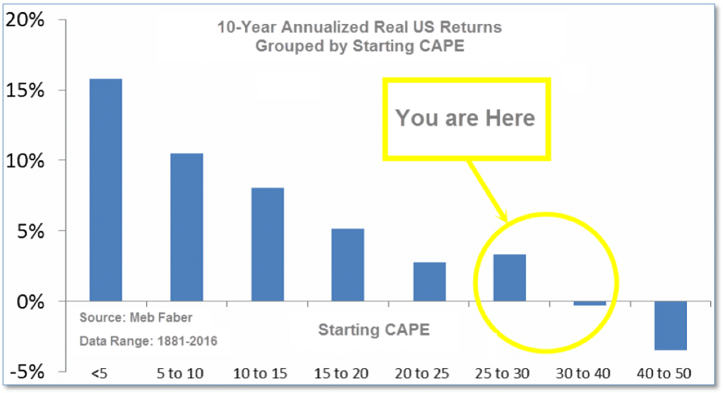
Figure 2 – Historical CAPE Range
Riverbend Technical Indicators
We view long term market cycles as months-to-years timeframe – the timeframe in which Cyclical Bulls and Bears operate. The U.S. Bull-Bear Indicator (see Fig. 3) is in Cyclical Bull territory at 75.04, up from the prior week’s 74.14.
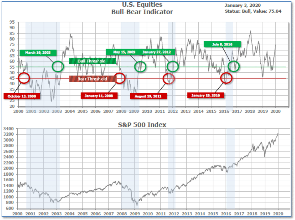
Figure 3 = Long Term Bull-Bear Indicator: US Equities
Intermediate And Short-Term Picture:
The Shorter-term (weeks to months) Indicator (see Fig. 4) is positive. The indicator ended the week at 32, unchanged from the prior week.
Separately, the Intermediate-term Quarterly Trend Indicator – based on domestic and international stock trend status at the start of each quarter – was positive entering October, indicating positive prospects for equities in the fourth quarter of 2019.
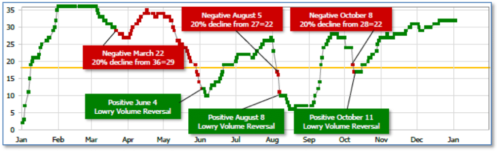
Figure 4 – Short Term Indicator: US Equities
SHUT vs DIME
The ranking relationship (shown in Fig. 5) between the defensive SHUT (“S”=Staples [a.k.a. consumer non-cyclical], “H”=Healthcare, “U”=Utilities and “T”=Telecom) and the offensive DIME sectors (“D”=Discretionary [a.k.a. Consumer Cyclical], “I”=Industrial, “M”=Materials, “E”=Energy), is one way to gauge institutional investor sentiment in the market.
The average ranking of Defensive SHUT sectors slipped to 13.50 from the prior week’s 13.00, and the average ranking of the Offensive DIME sectors fell to 20.25 from the prior week’s 19.00.
The Defensive SHUT sectors expanded their lead over the Offensive DIME sectors.
Note: these are “ranks”, not “scores”, so smaller numbers are higher ranks and larger numbers are lower ranks.
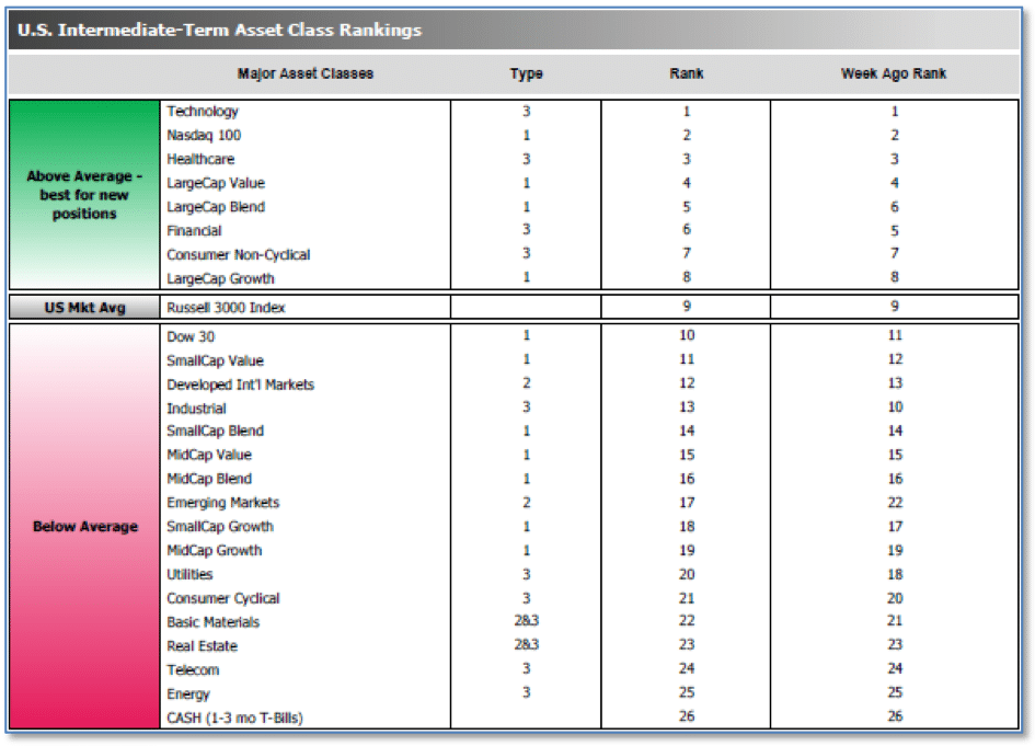
Figure 5 – Riverbend US Asset Class Rankings
Summary
In the Secular (years to decades) timeframe (Figs. 1 & 2), the long-term valuation of the market is historically too and favors actively managed investment strategies. The Bull-Bear Indicator (months to years) remains positive (Fig. 3), indicating a potential uptrend in the longer timeframe.
In the intermediate timeframe, the Quarterly Trend Indicator (months to quarters) is positive for Q1, and the shorter (weeks to months) timeframe (Fig. 4) is positive.
Therefore, with three indicators positive and none negative, the U.S. equity markets are rated as Positive.
Interesting Chart of the Week
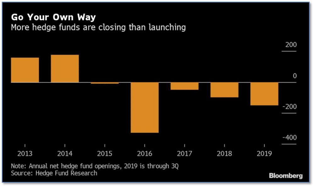
While most investors are likely celebrating gains in the stock market last year, those generally considered to be the top market professionals had less than lackluster returns.
According to data from research firm Eurekahedge, hedge funds returned just 6.96% on average in 2019—far below the 22.3% gain for the Dow and 28.9% gain for the S&P 500.
Underperformance by hedge funds has been the rule rather than the exception for most of the years since the Great Recession. Well-known hedge fund manager David Tepper – a frequent guest on CNBC and often quoted in the press – announced he was returning all outside money to his investors and hereafter only managing his own funds.
Investors themselves yanked a staggering $59 billion out of hedge funds last year in North America alone as the industry is on track to record more hedge fund closures than new hedge fund launches for a fifth consecutive year. The chart below, from Bloomberg, illustrates the five-year slump.