[fusion_builder_container hundred_percent=”no” equal_height_columns=”no” menu_anchor=”” hide_on_mobile=”small-visibility,medium-visibility,large-visibility” class=”” id=”” background_color=”” background_image=”” background_position=”center center” background_repeat=”no-repeat” fade=”no” background_parallax=”none” parallax_speed=”0.3″ video_mp4=”” video_webm=”” video_ogv=”” video_url=”” video_aspect_ratio=”16:9″ video_loop=”yes” video_mute=”yes” overlay_color=”” video_preview_image=”” border_size=”” border_color=”” border_style=”solid” padding_top=”” padding_bottom=”” padding_left=”” padding_right=””][fusion_builder_row][fusion_builder_column type=”1_1″ layout=”1_1″ background_position=”left top” background_color=”” border_size=”” border_color=”” border_style=”solid” border_position=”all” spacing=”yes” background_image=”” background_repeat=”no-repeat” padding_top=”” padding_right=”” padding_bottom=”” padding_left=”” margin_top=”0px” margin_bottom=”0px” class=”” id=”” animation_type=”” animation_speed=”0.3″ animation_direction=”left” hide_on_mobile=”small-visibility,medium-visibility,large-visibility” center_content=”no” last=”no” min_height=”” hover_type=”none” link=””][fusion_text]
Last week, the markets resumed their downtrend as investors continue to worry about inflation and what the Fed will do next. For the week, the S&P 500 fell 2%.
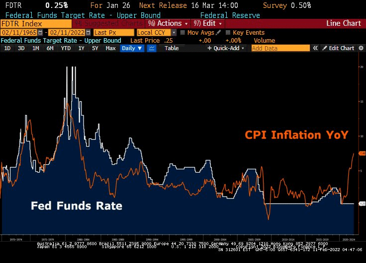
The most recent economic data showed inflation is much higher than expected. Friday’s CPI report revealed a 7.5% year-over-year surge in prices – a level not seen since 1982.
It’s beginning to look more and more like the Fed is behind the curve more than previously thought.
Historically, the Fed Funds Rate and CPI are closely correlated. The below chart shows where interest rates need to go just to catch up:
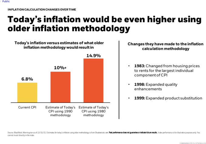
What is important to realize about inflation data, is the methodology of how it’s calculated has actually changed over time.
If we use the same methodology that was used in the 1980s. inflation is actually much higher:
(note, this chart uses data from 12/31/21 and does not include Friday’s, higher CPI number.)
Bond investors have been paying attention. But for some reason, stock traders have been slow to acknowledge the data.
So who is right? The data-driven bond investor? Or the emotional stock trader?
Only time will tell, but for now, the weight of the evidence favors continued volatility in the stock market.
As a result, our portfolios continue to remain in cash and/or hedged to market neutral.
Chart of the Week:
Geopolitical risk is rising as tensions between Russia and Ukraine escalate in Eastern Europe. Financial markets are watching closely as the situation evolves. Given these headlines, you may be wondering how geopolitical events historically impact the stock market.
Below is a list of 12 historical geopolitical events from past decades, and the S&P 500’s performance in the days and months after each of the events.
The data shows the stock market historically sells off when geopolitical events initially occur. The S&P 500’s average price return on the first trading day following the 12 events was -1.5%, suggesting investors sold stocks due to the initial geopolitical shock.
However, the data also shows the concerns faded over the following months. The S&P 500’s average 1-month price return following the events was +1.9%, showing the S&P 500 recovered its initial losses and more.
Over the following 6 months, the S&P 500’s average price return was +7%. The two notable exceptions were Pearl Harbor, which led to further U.S. armed conflict, and Iraq’s invasion of Kuwait, which coincided with an early 1990s recession that lasted from July 1990 to March 1991.
Geopolitical risks are always a concern, and the analysis below is not intended to minimize the events. However, there is limited historical evidence of geopolitical events and international conflicts impacting U.S. stock market performance.
In the absence of a direct impact, investors historically look past the events and focus on key long-term performance drivers, such as the economic environment and corporate earnings.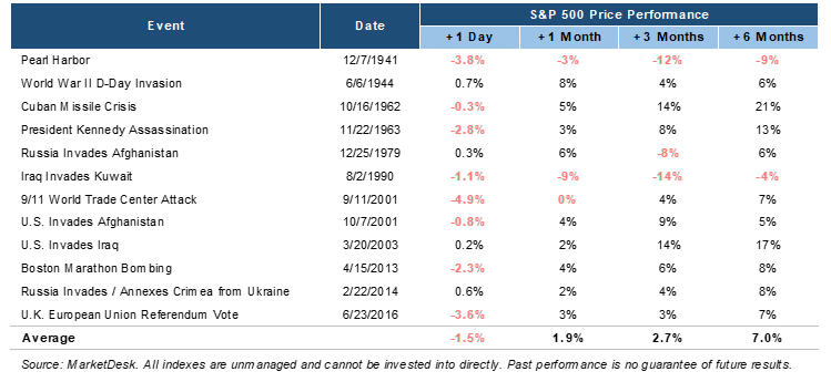
Riverbend Indicators:

- As a reading of our Bull-Bear Indicator for U.S. Equities (comparative measurements over a rolling one-year timeframe), we remain in Cyclical Bull territory.
- Counting up of the number of all our indicators that are ‘Up’ for U.S. Equities, the current tally is that two of four are Positive, representing a multitude of timeframes (two that can be solely days/weeks, or months+ at a time; another, a quarter at a time; and lastly, the {typically} years-long reading, that being the Cyclical Bull or Bear status).
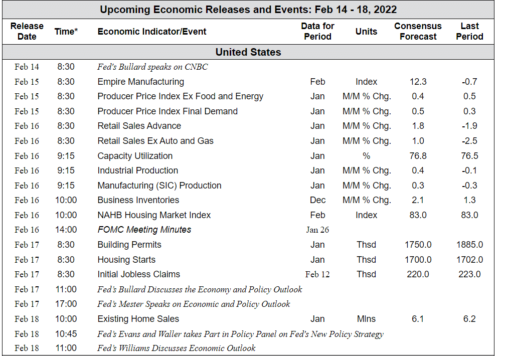
The Week Ahead:
[/fusion_text][/fusion_builder_column][/fusion_builder_row][/fusion_builder_container]